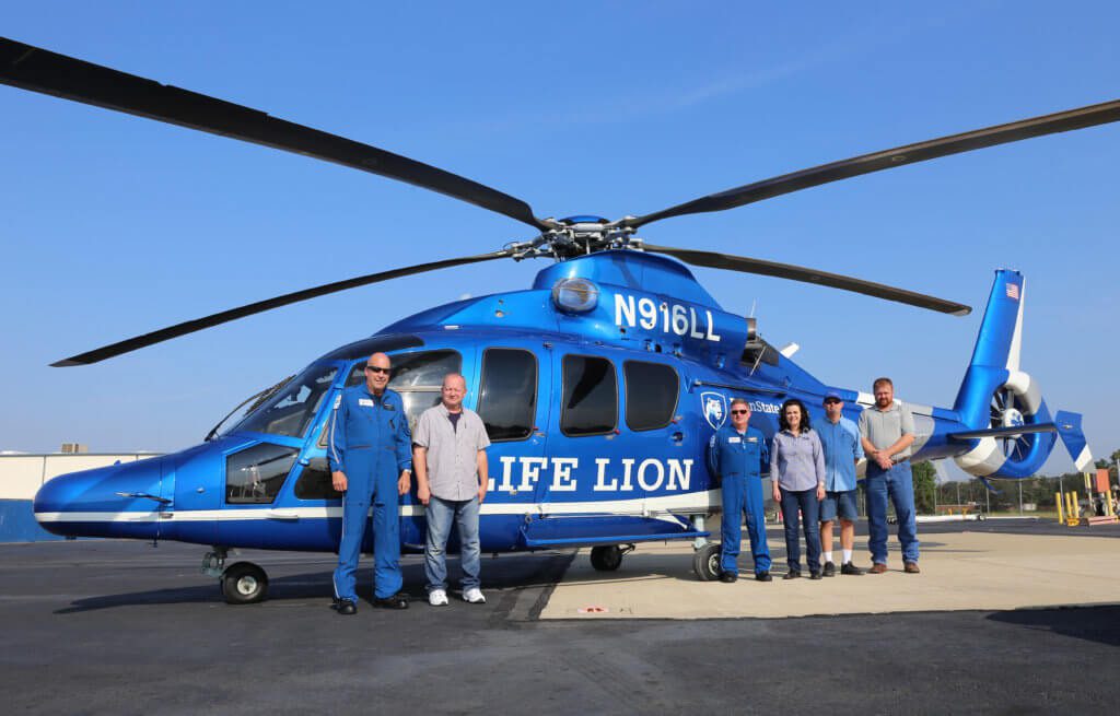
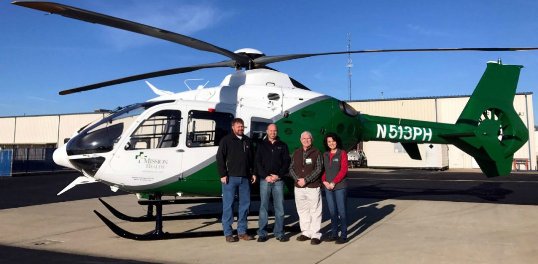
Building websites is an enjoyable and rewarding job if you are that type of person. Building and servicing helicopters that operate in eighteen states takes a whole different person. This is what Metro Aviation does every day. Metro currently operates more than one-hundred and thirty aircraft across the country. With a business like that, you need a website to showcase what you can do and the people that do it. This is exactly what we did for Metro.
WHAT IS METRO AVIATION?
Metro Aviation started off as a helicopter charter, training, and maintenance operation in 1982. It was not until 1983 when Metro entered into the medical service business. They began to provide ambulant transportation services for Schumpert Medical Center in Shreveport, Louisiana. Since the beginning Metro has seen a great deal of growth and has remained a cornerstone for excellence in the helicopter transportation industry.
I’ll let Metro speak for themselves: “Our completion center has installed full law enforcement and air medical kits, components and avionics packages for new and repeat customers. Quite often, Metro Aviation not only performs the installation but purchases the aircraft and trains the ground and flight personnel.
In this highly competitive industry, there are many legitimate concerns when considering a service provider. Few companies can provide the services, dedication, stability, and excellence of Metro Aviation.”

THE DESIGN
With every website, you want to be able to create something that can stand the test of time. Building something that will look outdated in three years is not the way to go. When we approached Metro’s new website, we wanted to catch the user’s eye right out of the gate. What better way to do that than putting a big video right at the beginning. Incorporating video content into your business strategy is becoming more and more and important. We wanted to embrace that and grab people’s attention right away.
With the layout of the content, we wanted to make something that stood out but also kept that professional look. The content and different sections utilize the full width of the page, giving the content room to breathe. It also gives all the content and images the room it deserves, letting each section shine in its own right.
“Our website was overdue for a refresh and I had so many ideas in mind as far as the look and feel I wanted to approach,” said Kristen King Holmes, Metro Aviation Marketing Director.”
“The one thing I knew I wanted was a full-screen video on the homepage. Websites that incorporate that always catch my eye. The team at Ruby Shore Software not only ran with my vision, but they learned my preferences and added little details along the way. One of my favorite features is the brochure call to action at the bottom of most of the pages. Without any direction from me, they incorporated an image of our brochure that smoothly moves in from the side and then lays over its box and on top of the section above it. Those little aesthetics are really important and they get it!”

We really liked that blue color that Metro chose to use for their branding and we wanted to make sure we encapsulated that with the new designs. That is why throughout the site we have implemented that blue or a slight variation of it to keep things fresh and modern.
Overall we wanted to showcase Metro in a whole new light and also bring their rich history to a new, modern look.
THE PROCESS & CHALLENGES
With every website we do, we like to start with the basic wireframes to build out the structure of the site. Then, after that is approved, we move towards the website mockup. This process can include actual images, colors and copy from the client. But sometimes the mockups are built out with dummy text to better showcase the design we are going for. This was no different with Metro. However, there were some interesting additions we did for this project.
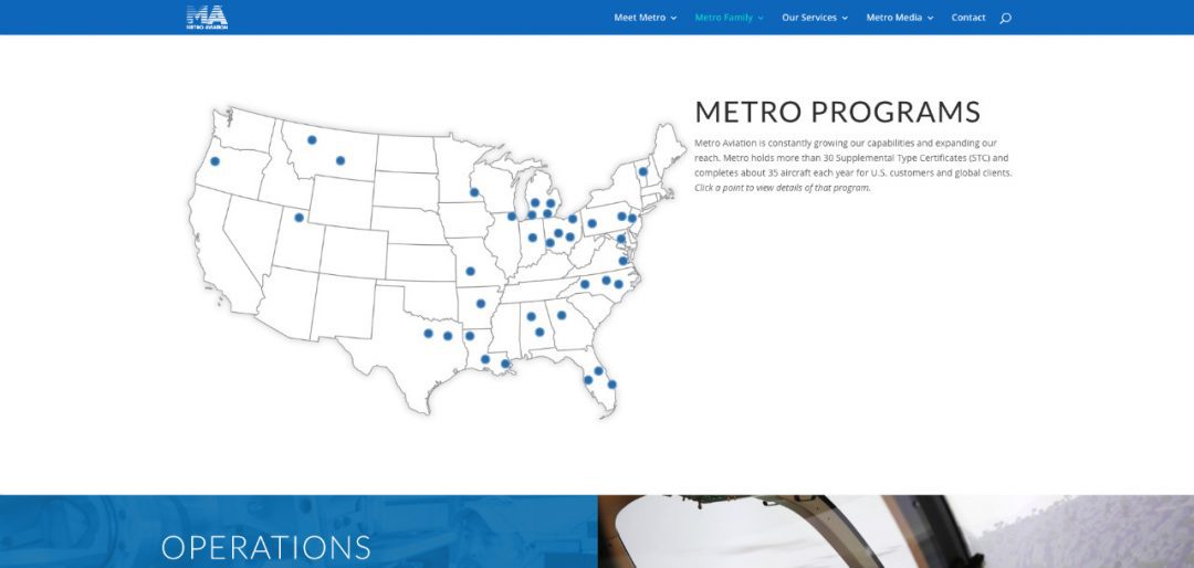
The really cool map you see on the Maps of Programs pages is something that we did custom just for Metro. First, it highlights each location all around the country, but it also shows you the location information once you hover over the location icon on the map. This was a great addition to the site but was a tricky thing to construct and put in the CMS. After some very fancy CSS work by our Lead Designer, Dustin, the map was perfect.
“The map is a huge deal to us. We like to take every opportunity to showcase our customers, which we refer to as our ‘Metro Family.’ Dustin took the idea of the map that we’ve had in several website iterations in the past and modernized it. I can’t say enough about the refreshed look he gave our site.”

One very positive experience we will take away from this project was working with Metro’s Director of Marketing, Kristen. She was always on top of any task we threw at her to move the project along. She was quick to reply and always relaying feedback to us, as we were updating the site. It was fantastic to have someone like that on the client’s side of things, helping us along the way.
THE END RESULT
We and the wonderful people over at Metro are very pleased with the final product (which you can see here). It is something we are proud to have worked on and something that Metro deserves. We learned a lot from this project and will carry that over into the next one.


